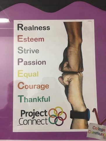
This is an example of a Project Connect Poster that includes one of the five main themes that is ‘Respect’. In this poster, the person has been quite creative as they have used two people fist bumping, which is a worldwide well-known example of respect. However, it’s not just any persons coloured skin that they’ve used, they’ve specifically used a lighter and darker skinned person’s fists – this shows equality, which also falls into Project Connect. The person has been creative again as they produced a word for each letter that is included in the word respect. For example, ‘R’ represents ‘Realness’, ‘E’ represents ‘Esteem’ and so on. They have also added colour for each word that is on the poster and five of the words follow the colour of the Project Connect logo, which include; Red, Purple, Yellow, Orange and Green.
In my opinion, I like this poster because of how simple it is. It gets the job done by getting the point across easily, clearly and simply with it having all the information and the creativity that it needs. It has an image, it has colour, it has the Project Connect logo to tell the audience what it’s about/involves and it stands out. However from a designers point of view, there are a few things that could be improved on this poster and they are the fonts, the colours and to make the poster stand out to the eye more, shapes could be added to it. The fonts could be changed to a more fun font like ‘Mister Vampire’ for example to make it more appealing to the audience and it doesn’t necessarily matter which font as if it’s fun, it should appeal to anybody and do the job that it needs to do which is to attract people. The colours that could be used don’t really need to be changed from the original poster, however I think that they could be made brighter which will stand out more and will grab more attention but it will also look more appealing and cleaner than if it’s a darker shade of colour for example. Shapes could be used in this poster to create and add more attention to it for an audience to see. They are also good to use if you have or want information on it as it can break the information up so it will make it more fun and easier to read for the audience/reader. Tracking is used on this poster for all of the words used and I know this because tracking the exact measurement space between each letter. Leading is used on this poster also as it is eligible for the reader/audience to read it clearly and easily. This means that you can't have bad ascenders or descends as it will overlay other writing/information, it won't look as clear and would be incorrect to have. Kerning is also used as kerning is the space between two letters of a word and an example of this is the word Thankful on the poster.


The main colour theme in this poster represents black. This can show power, elegance and formality which can easily stand out to the reader. They have used red which can represent strength, power, determination and desire. They have used a little bit of purple that represents power, nobility, ambition, dignity and creativity and they have also used a little bit of orange which represents happiness, creativity, determination, success and encouragement.
In my opinion, I am not the biggest fan of this poster as 75% of it is black which to me makes it look quite dull and boring. But also if I was to walk past it, it wouldn’t stand out to me because nothing is eye catching enough to grab the reader’s attention. From a designer’s point of view and my point of view, there are many things that could be improved on this poster and they are the fonts, the colours to try and make the poster stand out to the eye more and the layout. The fonts could be made bigger, bolder and more colourful to stand out to an audience/reader. You could also change the font to something like ‘Prezident’ which is more fun and creative and with colour, as you can see it is very appealing to the eye – this is what is needed for a poster. The colours used should be bright and colourful and should follow the colours from the Project Connect logo ideally in my opinion as that is what the topic is about. Tracking is used on this poster for all of the words used and I know this because tracking the exact measurement space between each letter. Leading is used on this poster also as it is eligible for the reader/audience to read it clearly and easily. This means that you can't have bad ascenders or descenders as it will overlay other writing/information, it won't look as clear and would be incorrect to have.
No comments:
Post a Comment