
This is a good example of Leading in Typography for when typing up an article. It can't be too little or too much as it has to be just right and eligible for the reader/audience to read it clearly and easily. So this means that you can't have bad ascenders or decenders as it will overlay other writing/information, it won't look as clear and is incorrect to have in a writing piece/article.

This is an example of Tracking in Typography for when typing up an article. Tracking is the exact measurement space between each letter.

This is an example of Kerning in Typography for when typing up an article. Kerning is the space between two letters of a word.

This is an example of Legibility and Readability. Legibility is the quality of being clear enough to read and Readability is the ease with which a reader can understand written text. The good thing about Legibility is that it is very clear to read which of course is very helpful as what is the point in trying to read something that you can't or that you may struggle with. For example this image below:
Readability is basically the same as Legibility, however it is set out in a more professional way.


This is an example of a Sans Serif poster. The font is big, bold and clear and stands out to a reader/an audience. The poster looks legible, futuristic and modern because of the colours used and the way it looks/the way it is laid out. Although this poster could appeal to any target audience, I think the majority would be set for a younger target audience.
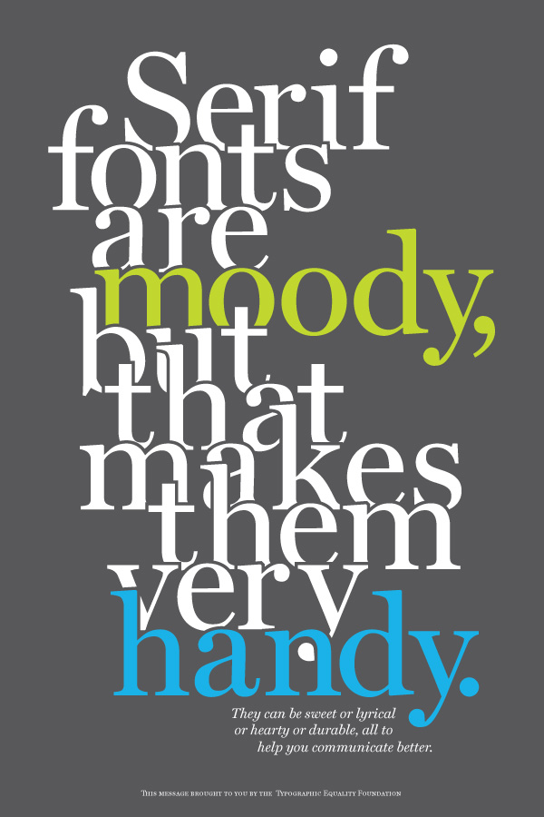
This is an example of a Serif poster - you can also tell that it is Serif as you can see the strokes at the ends of the letters. The font is thinner, less stricter and is less at you compared to the Sans Serif poster. The poster is readable and it tries to be modern by using the colours that it does, however it is still old fashioned and it still set for an older target audience. This poster has overlapping leading, however it is still readable and it is still suitable to use.

This is an example of Font Family. A font family is the Complete collection of typefaces having the same point size and designed to work together. For example, a times Roman font family may include Times Roman Bold, Times Roman Extra Bold, Times Roman Italic, Times Roman Bold Italic, Times Roman Condensed and so on. I like this design because of how simple it is but also because of how much it stands out.

This is another example of Font Family. I like this design because although its the same colour font, the font changes size and angles/direction which is appealing to the eye.
No comments:
Post a Comment